How To Use The Heatmap
The Heatmap is designed to empower you in exploring and visualizing relationships within your data.
Whether analyzing the correlation between listed amounts and scores, or examining the relationship
between listed amounts and liquidation percentages, the Heatmap offers a visually intuitive
representation. This enables you to identify patterns, trends, and potential correlations that
might not be immediately apparent in tabular form. With this Heatmap report, you can delve deeper
into your data, making informed decisions and unlocking new opportunities.
The report settings that generate the Heatmap are fully configurable, offering you flexibility
and control over your analysis. Upon initiating the Heatmap generation, you will be prompted
with a series of configurable options tailored to your specific analytical needs. These prompts
include parameters such as the choice of variables for analysis and the granularity of the data
segmentation. Each prompt is accompanied by clear explanations, empowering you to make informed
decisions that align with your analytical objectives.
Prerequisites
This utility is part of the Inventory Management Scenario Package. You can obtain the Inventory
Management packes by logging into the Member Center and downloading the Scenario Package
from here.
Depending on your preference settings, the Heatmap is designed to show you which segments of your
inventory are liquidating best for you and which are not. This identification can assist you with
making strategic inventory management decisions and/or adjusting your new account distribution
strategies.

Key Aspects
Before diving into the Heatmap generation process, it's essential to understand a few key aspects:
- The Heatmap utilizes data from ALL Modes as well as any applicable content in selected
parameter range(s) from the Archive database. Listed Amounts use debtor Original Principal
and Original Interest where there is no Judgement. If there is a Judgement Date on account,
then the Judgement Principal and Original Judgement Interest are used instead.
- By default, the Heatmap reads score data from the 'score' field. If your system uses a
different field for scores, such as 'risk score,' you can easily customize this setting.
For example, if your system utilizes 'risk score', you would modify the report parameter
from '@tvarXFieldName* = "de_owned_by_ debtor"' to '@tvarXFieldName* = "de_risk_score"'.
Or contact support department for assistance.
- The colors of the Heatmap's shaded zones are predefined within the report. If these
colors do not align with your preferences, you have the option to modify them. The
background and text colors of the shaded zones can be adjusted using the variables
'@tvarHeatColor[1][1]* = "#ffffe5"' and '@tvarHeatColor[1][2]* = "#000000"',
respectively. The '[1]*' denotes the background color, while the '[2]*' represents
the text color.
Explanation Of Report Configuration Prompts
Use of Score or Liquidation Percentages
The Heatmap uses 2-axis graphical output of either Score + Listed Amount ranges OR
Liquidation % + Listed Amount ranges. The purpose of this selection is to define whether your second
axis will be Score OR Liquidation. If you don't use Scoring with a credit bureau or probability
scoring vendor, then choose one of the Liquidation options (all states or with state exclusions,
for example if you have closed-border states you are not permitted to collect in).
Use of Score or Liquidation Percentages Prompt
Heat Zones
The next two sections involve defining your Heat Zones: these are liquidation
percentage ranges represented graphically as cell background colors. These will be one
color that is divided into shade gradients, lightest (low Liq % or $ Recovered) to darkest shade
(High Liq % or $ Recovered).
It should be noted however, that a low liquidation percentage doesn't always equate to low agency
revenue. For example, some types of debt tend to liquidate low in smaller listed amount ranges,
but overall results in much higher actual dollars recovered by the agency.
Clusters of same-shaded cells in the darker color end of the spectrum in a Result spreadsheet define
your statistical high recovery zones. Depending on how your portfolio liquidates, hot zones
may tend to move around the Heatmap as economy and other factors impact results. Staying in the know
of how your streams of business are liquidating will allow you to proactively identify trends early
and action accordingly to either ward-off downtrends or amplify uptrends. Proactive actioning on
early trend identification may be any, all or combinations of:
- strategy tweaks
- staffing adjustments
- automation usage
As stated earlier in this Help Document, a Heatmap can show you areas of surprise. These are
segments which statistically, by Listed Amount/Score OR Listed Amount/Liq %
wouldn't be expected to be a significant amount of an agency's revenue BUT in actuality represent
a significant amount of gross revenue. For example, a Liq % of 5.1% representing over $1M in
generated gross revenue over the 12-month period.
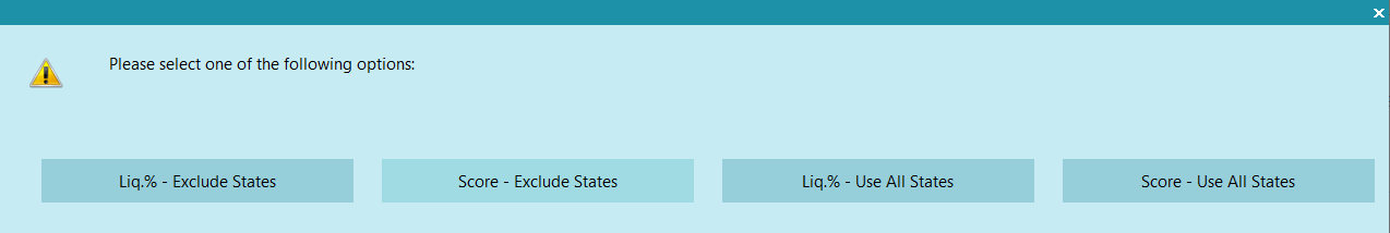
The prompt will inquire whether to utilize the score field or liquidation percentage. It also offers
the option to exclude states from the report. Here is an explanation of each option:
- Liq.% - Exclude States: This option utilizes the listed amount as one axis
and the liquidation percentage as another axis. Once selected, it will prompt the user to
exclude states.
- State exclusion prompt: Enter state(s) to be excluded. For multiple
states, use commas without spaces to separate them (e.g., CA,WA,ID). If left blank,
it will include all states.
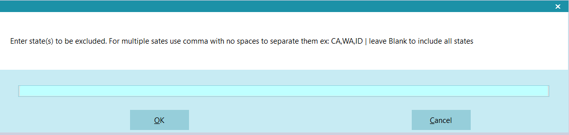
State Exclusion Prompt
- Score - Exclude States: This option utilizes the listed amount as one
axis and the liquidation percentage as x and y axes. It uses the same state exclusion
prompt as shown in figure #2 above.
- Liq.% - Use All States: This option utilizes the listed amount and the
liquidation percentage as x and y axes.
- Score - Exclude States: This option utilizes the listed amount and the
score field as x and y axes.
Heatmap General Configuration Settings
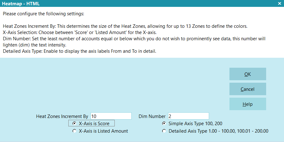
Heatmap General Configuration Prompt
- Heat Zones Increment By: defines how many percentage points spread you want
to use to define each Heat Zone. If your entire portfolio is liquidating between 1.15% to
3.67%, you might want to increment by a fractional value such as 0.75. If your portfolio is
liquidating between 1.15% to 110% (which can happen if accrued interest/costs are being added
to balances), you might want to increment by 10. The larger the number of Heat Zones
defined for your Heatmap output, the more fragmented/diffuse your results will
be. As you use this tool, the old adage less is more will help your
analytics be more meaningful.
- Dim Number: Number is a setting that will control the cell text font color
from regular black to pale grey where cells containing data carrying results
representing too few accounts to be statistically valid even if the results are
in target ranges are dimmed in appearance so as not to invite undue attention.
These results are your outliers: the cells with the atypical few accounts that PIF'd or
had a large payment but do not represent a volume of accounts with similar results.
Small-sample results should not influence inventory management or staffing decisions. This
setting defines your threshold for how many accounts is the least number you want
to be statistically considered. This will be an individual preference that
your data will identify for you. For small sites, this may be a value between
2 to 5 accounts. For large volume sites with hundreds of thousands to millions of debtor
records, that would be a much larger number (may be in hundreds versus single to double digit
value). You should try different values as they learn your data and determine what
is a reasonable figure to input for this parameter. Number of accounts in each cell
is part of the output.
- X and Y Axis: To set your preference of what data appears in your X or Y
Axis, a preference by clicking the radio buttons on the left needs to be made. If you
selected either of the Liquidation options in the previous step, then the prompt will offer
X-Axis is Liquidation % or X-Axis is Listed Amount. If you selected either of the Score
options in the previous step, then the radio buttons to define what will appear as your
X-Axis will reflect Score
- Axis Type: A Simple Axis of '100' outputs an axis displaying
only the topmost value in that row or column: it presumes 1-100 is contained in '100', and
'200' output presumes 101-200 etc. Detailed Axis shows you the true range
of values contained in each row or column of the output: the axis will display the range as
1.00 – 100.00 explicitly. You may have your own preferences for this cosmetic layout
feature.
Heatmap Shaded Zones Minimum And Maximum Caps
The Min & Max Caps should be considered the 'tails' of a normal bell curve, meaning values
contained within that range will be grouped together in the 'low' values as well as the 'high'
values. This allows you to focus on the better liquidating ranges in your data.
For example, the following is a standard bell curve, which collection recoveries generally graphs
out to with large enough samples when results are examined in comparable batches ( client types)
and a reasonable number of listed months (so economic fluctuations etc. don't skew results). A
reasonable number of months, depending on economy & type of business is 9 – 12 months max
Listed Date range.
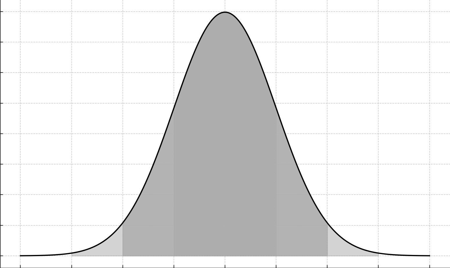
Normal Distribution Curve
The light and medium grey-shaded areas in the above normal distribution are representative of Min
and Max Caps: values below or above which you'd want to have grouped into a single category because
values in those regions are not of particular interest. This allows you to focus on the most
profitable accounts.
 Heatmap Zones Increment By is decided from the previous prompt.
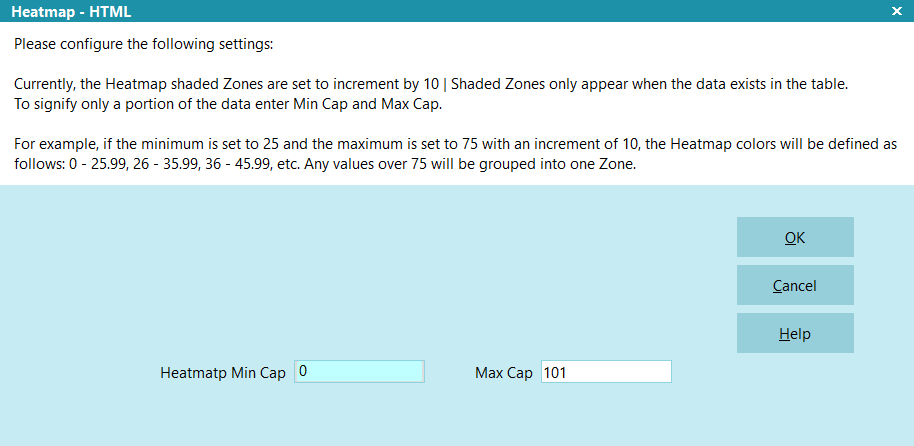
Heatmap Zones Cap Prompt
- Heatmap Min Cap: This option is used to define your leftmost 'tail' of the
bell curve, below which you do not wish to see granular breakout by color.
- Heatmap Max Cap: This option is used to define your rightmost 'tail' of the
bell curve, above which you do not wish to see granular breakout by color.
Anything that falls between Heatmap Min and Max Caps will increment by the "Heatmap Zones Increment
By" value that is passed from the previous prompt.
For instance, if the increment is set to 10 and the minimum cap is 25, then the Heatmap colors will
be defined as follows: 0 - 25.99, 26 - 35.99, 36 - 45.99, and so on. Any values exceeding the
maximum cap of 75 will be grouped into one label.
Configure X-Axis Minimum And Maximum Caps
Identify the X-Axis minimum and maximum caps to consolidate values
below or above which you would like to appear in a single cell.
X-Axis could be score, listed amount, or liquidation percentage, as decided
from the previous prompts. This can be seen on the prompt which field is used as X-axis.
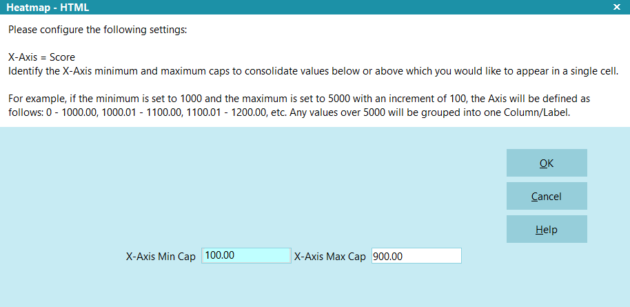
X-Axis Minimum and Maximum Caps Prompt
- X-Axis Min Cap: This option is used to group any field value from 0.00 up to
this value into one grouped label.
- X-Axis Max Cap: This option is used to group any field from this value and
up into one grouped label.
Anything that falls between X-Axis Min Cap and X-Axis Max Cap
will increment by the values which are set in the report filtering prompt.
For example, if the minimum is set to 1000 and the maximum is set to 5000 with an increment of 100,
the Axis will be defined as follows: 0 - 1000.00, 1000.01 - 1100.00, 1100.01 - 1200.00, etc. Any
values over 5000 will be grouped into one label.
Configure Y-Axis Minimum And Maximum Caps
Identify the Y-Axis minimum and maximum caps to consolidate values
below or above which you would like to appear in a single cell.
Y-Axis could be score, listed amount, or liquidation percentage, as decided
from the previous prompts. This can be seen on the prompt which field is used as Y-Axis.
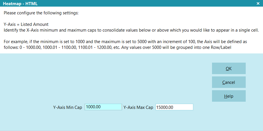
Y-Axis Minimum and Maximum Caps Prompt
- Y-Axis Min Cap: This option is used to group any field value from 0.00 up to
this value into one grouped label.
- Y-Axis Max Cap: This option is used to group any field from this value and
up into one grouped label.
Anything that falls between Y-Axis Min Cap and Y-Axis Max Cap will
increment by the values which are set in the report filtering prompt.
For example, if the minimum is set to 1000 and the maximum is set to 5000 with an increment of 100,
the Axis will be defined as follows: 0 - 1000.00, 1000.01 - 1100.00, 1100.01 - 1200.00, etc. Any
values over 5000 will be grouped into one label.
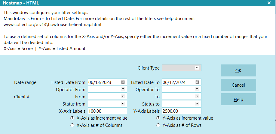
Filter, X-Axis And Y-Axis Configuration
This prompt offers you several options, most of which are designed to filter the data to ensure
only the desired subset is included in the Heatmap for analysis. The only mandatory option on this
prompt is the Listed Date range, From and To. Additionally, you can control the Heatmap's X and Y
axes increments or the number of rows. The prompt also displays whether the X-Axis and Y-Axis
represent score, listed amount, or liquidation percentage. Here's an explanation of each option:
Filter, X-Axis and Y-Axis Configuration Prompt
- Client Type: This filter allows you to specify client types. It's typically
recommended to focus on one type of account, but if left blank or an unknown option is selected,
this filter will be ignored.
- Date Range Listed Date From and Listed Date To: This option is used to filter
accounts based on their listed date. these fields are mandatory.
- Operator From and To: You can filter data by operator using this option.
If left blank, it will include all operators.
- Client# From and To: This option filters accounts by client numbers. If left
blank, it will include all clients.
- Status From and To: You can filter data by statuses using this option.
If left blank, all statuses will be included.
- X-Axis Labels: This indicates the increment between your label values on this
axis OR the number of represented columns that will be labeled output in
your Heatmap. This is tied to selecting X-Axis as an increment value OR
X-Axis as the number of columns, determined by the radio buttons under the leftmost bank of
fields, respectively.
- Y-Axis Labels: Similar to the X-Axis, this indicates the increment between
your label values on this axis OR the number of rows that will be labeled
output in your Heatmap. This is tied to selecting Y-Axis as an increment value
OR Y-Axis as the number of rows, determined by the radio buttons under the
rightmost bank of fields, respectively.
Notification And Messages
This prompt appears only when the Client Type (e.g. Medical, Retail, Banking, Automotive etc.) is
not selected and/or the Listed "From" date is more than
one year in the past.
The message serves as a notification to the user executing the report in case the options are not
set for most optimal usage. Liquidation curves tend to be portfolio type-specific, e.g. Commercial
doesn't liquidate at the same rate as Retail etc., and as such, that means outputting results where
different types of accounts are being mixed together will not give best results. Data averages being
output will provide a blurred picture due to Client Type blending: important trends as may be necessary
to see on a Client Type basis will be masked or less apparent due to the
blended request and/or overlong period where recovery conditions may have
changed significantly in specific timelines.
We recommend using Type specific Heatmaps that select Listed Date ranges that do no not exceed 12 months.
However, the ultimate choice resides with you. If you choose to mix Client Types and/or use a wider
Listed Date range, then the report will continue after you click OK.
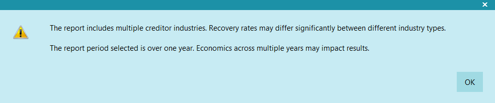
Notification and Messages Prompt
- The report includes multiple creditor industries. Recovery rates may differ
significantly between different industry types. This message appears when the client
type is not selected or "unknown" is passed.
- The report period selected is over one year ago. Economic changes over multiple years
may impact results. This message appears when the listed "From" date is more than
one year in the past.
Enhanced Analysis With Weighted Recovery Percentage
By default, the Heatmap favors high liquidation results in the output cells. Without weighting,
your highest Liq % cell values will be what gets shaded darkest in the Heat Zones.
What weighting will do for you, is identify where actual recovered dollars are high even
if the liquidation percent is quite low. For example, Liq % for cell is 5.17% and recovered
gross dollars is $1.5M. In the weighted version of the output, 2 accounts liquidating for an
average of 80% will NOT be in output as one of the darkest shaded hot zones while the 1,523
accounts representing 5.17% for $1.5M will be shaded dark to indicate a hot zone.
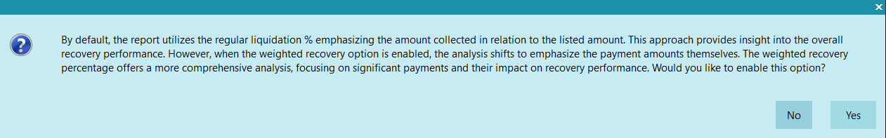
Prompt To Enable Weighted Recovery Percentage
Suppose your selected criteria produced the following data:
  Listed Amount                          = $120.00
  Paid Amount                            = $95.00
  Min (of Weighted Recovery Percentage*) = 0.00
  Max (of Weighted Recovery Percentage*) = 50000.00
  * See Weighted Recovery Percentage calculated below.
Understanding Recovery Percentage
Recovery Percentage is a measure that indicates the percentage of the listed amount that has been
paid. It is calculated by dividing the amount paid by the listed amount and then multiplying by 100
to express it as a percentage. For example, if $95.00 is paid out of a listed amount of $100.00,
the Recovery Percentage would be:
  Recovery Percentage = (Amount Paid / Listed Amount) * 100
                      = (95.00 / 120.00) * 100
                      = 0.7917 * 100
                      = 79.17%
Introducing Weighted Recovery Percentage
Weighted Recovery Percentage takes into account both the Recovery Percentage and the actual amount
paid. This means that higher payments are given more weight in the analysis. For example, if the
amount paid is $95.00, the Weighted Recovery Percentage would be:
  * Weighted Recovery Percentage = Recovery Percentage × Amount Paid
                                                                 = 79.17 × 95.00
                                                                 = 7521.15
Normalizing the Weighted Recovery Percentage
When analyzing data using weighted recovery percentage within a single dataset, normalization plays
a crucial role in ensuring fair comparisons across different entries.
Consider a scenario where our dataset contains weighted recovery percentages that vary in range.
Some entries may have values ranging from 0 to 100, while others may range from 0 to 10,000.
Directly comparing these values without normalization could lead to skewed interpretations due to
the differing scales.
Normalization addresses this issue by scaling all values within the dataset to a standard range,
typically between 0 and 100. This ensures that each entry is evaluated relative to the entire
dataset, rather than solely based on its raw value.
Let's illustrate this with a simplified example from our dataset:
- Account #1: Weighted Recovery Percentage: 50
- Account #2: Weighted Recovery Percentage: 5000
In this scenario, without normalization, Account #2 may appear significantly higher than Account
#1 simply due to its larger raw value. However, after normalization, both accounts are scaled to
a common range within the dataset:
  Normalized Account #1:
  Scaled Value = (50 - Min) / (Max - Min) * 100

  Normalized Account #2:
  Scaled Value = (5000 - Min) / (Max - Min) * 100
By applying normalization to our dataset, we ensure that each entry's weighted recovery percentage
is evaluated relative to the full range of values within the dataset. This enables fair and meaningful
comparisons, allowing us to identify patterns and trends accurately.
For example, if the calculated Weighted Recovery Percentage is 7521.15 and the Min and Max values
are 0.00 and 50000.00 respectively, the scaled value would be approximately 18.05%:
  Scaled Value = ( (7521.15 - 0.00) / (50000.00 - 0.00) ) * 100
               = (7521.15 / 50000.00) * 100
               = 0.150423 * 100
               = 15.04%
Heatmap Result
The below image illustrates a sample Heatmap generated with default settings, offering insights
into the dataset's recovery performance. Below is a comprehensive guide to interpreting the
Heatmap data:
- Y-Axis Labeling: The vertical axis represents the listed amount, spanning
from 1000 to 1053235. This axis segments the dataset based on the magnitude of the listed
amount, aiding in the identification of patterns related to different debt levels.
- X-Axis Labeling: The horizontal axis displays the Score, ranging from 1 to
10 as in this example, the mock-data is using a probability score vendor rather than a credit
bureau Fico score.
- Z-Axis Interpretation: Each cell in the Heatmap corresponds to a specific
intersection of the Listed Amount and Score. The cell's value represents the recovery
percentage achieved for that particular combination. For instance, a cell located in the
listed amount range of 0-1000 with a score of 0-1 displays a recovery percentage of 4.47%.
Additionally, it provides information on the total collected amount, such as $711,984, and
the number of paid accounts, such as 2,618. Clicking on any cell allows you to
access a detailed list of accounts within that cell, grouped by state.
- Cell Content Sample: This section offers an explanation of the values within
a sample cell, ensuring you understand the data presented. In cases where the weighted
average is selected, you will find an additional option representing the weighted recovery
rate alongside the conventional recovery rate.
- Heatmap Shaded Zones: These color-coded zones delineate different recovery
ranges, enhancing the visualization's clarity and enabling quick identification of trends or
anomalies across the dataset.
- Z-Axis Formula: Hovering over this button reveals the formula used to
calculate the recovery percentage, providing transparency and empowering you to understand
the underlying methodology.
- Download CSV: You can utilize this feature to download the Heatmap data along
with detailed account-level information. This enables further analysis and exploration of the
dataset outside the visualization tool.
This comprehensive guide equips you with the knowledge and tools necessary to effectively interpret
and leverage the insights offered by the Heatmap visualization.
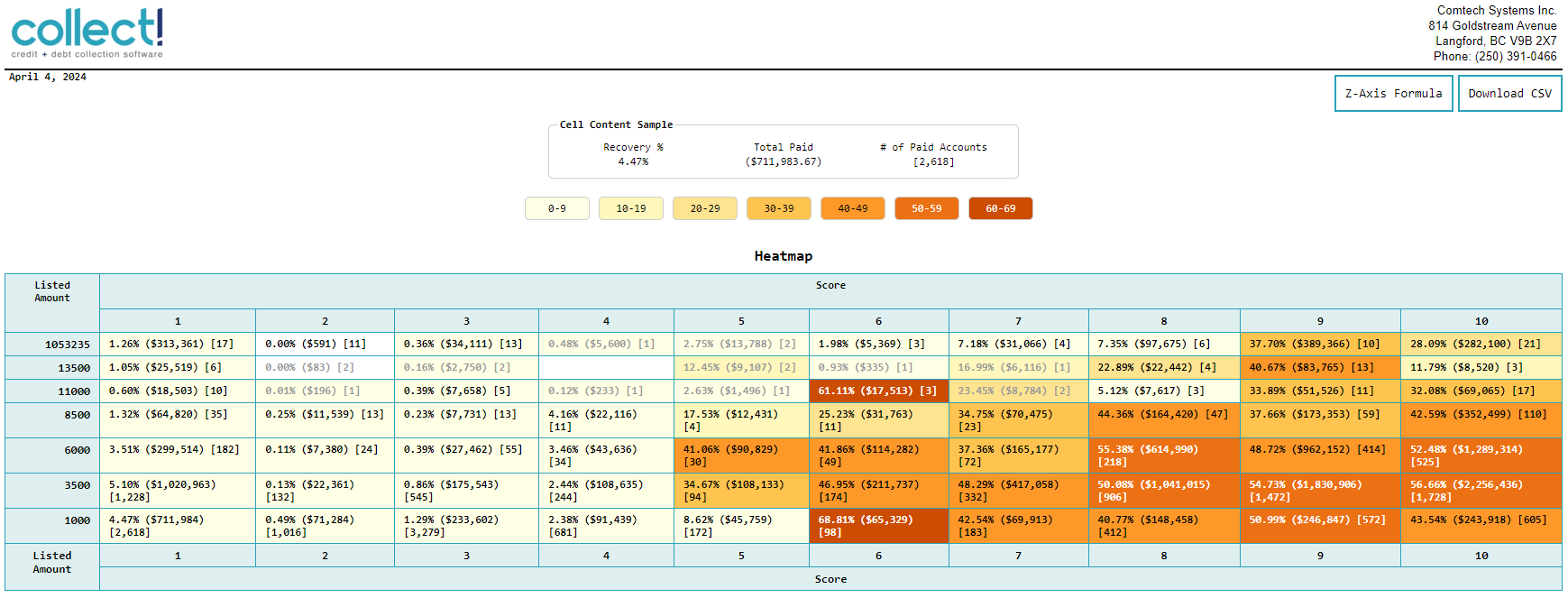
Heatmap Sample Result
| 
Was this page helpful? Do you have any comments on this document? Can we make it better? If so how may we improve this page.
Please click this link to send us your comments: helpinfo@collect.org